The challenge
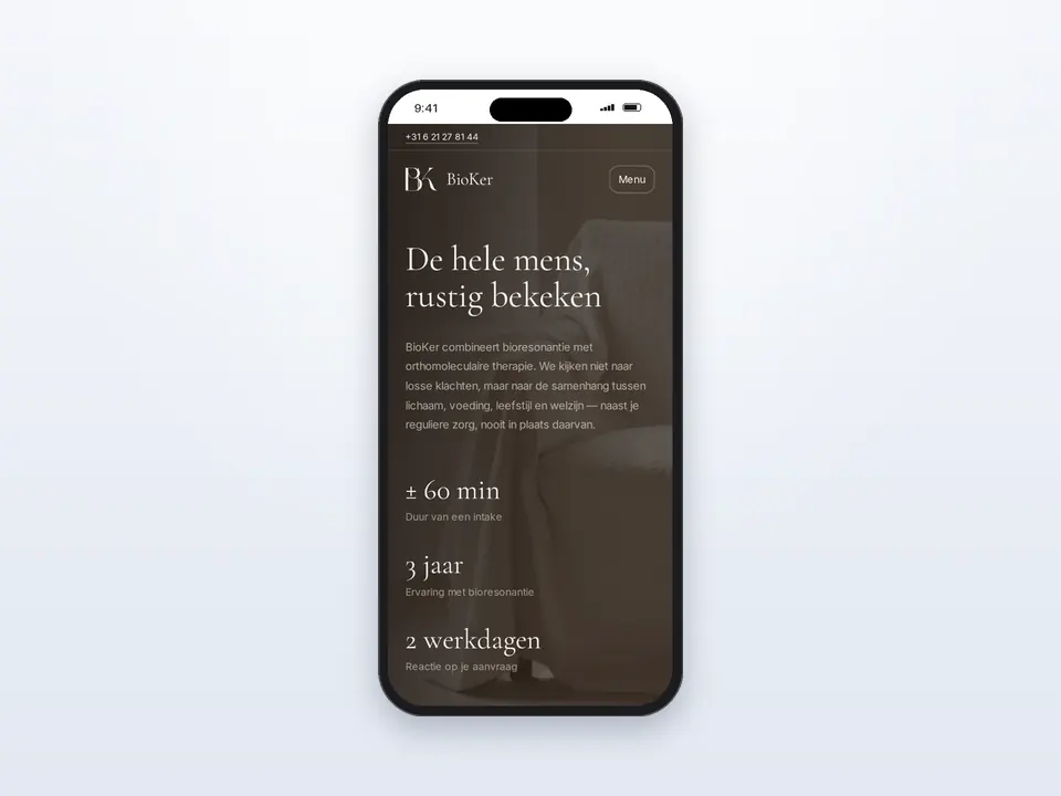
BioKer combines bioresonance with orthomolecular therapy and looks at the person as a whole, always alongside regular care and never instead of it.
In this field many sites communicate with exaggerated promises. BioKer wanted to be explained calmly, carefully and without promises.
Our solution
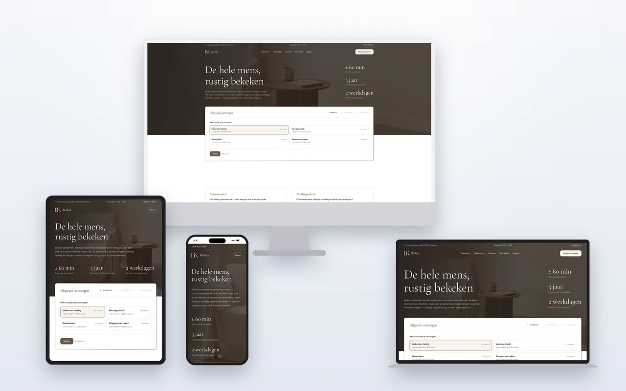
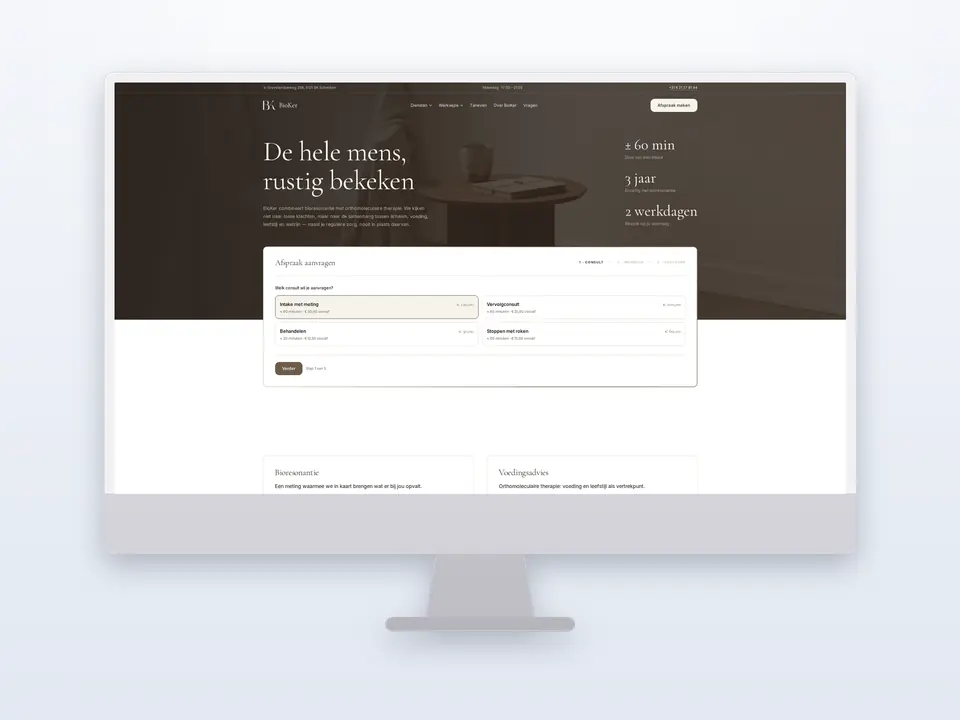
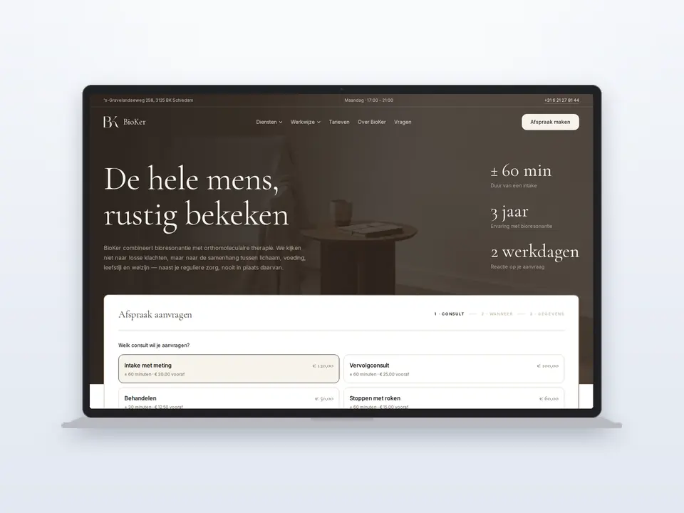
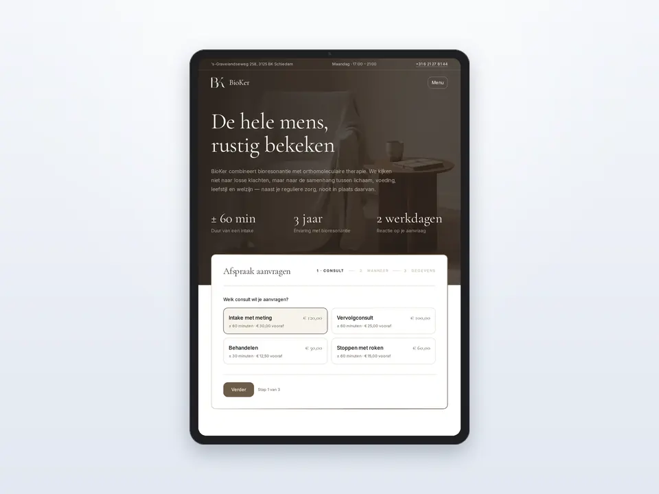
First we made a brand book: the fonts Cormorant Garamond and Inter, the colours walnut, espresso and ivory, plenty of white space and fine lines. Then we programmed the site in that style on Next.js.
The structure revolves around methods, working method, rates, advice for children, nutrition advice and frequently asked questions. Every page leads the visitor to an appointment request.
The result
BioKer now has a fast, polished site that explains the work calmly and understandably.
Visitors see in advance how a consultation goes and what it costs; requesting an appointment is possible from every page with one click.